
TURNING PASSION INTO CONVERSION
CLIENT: FANFIRE
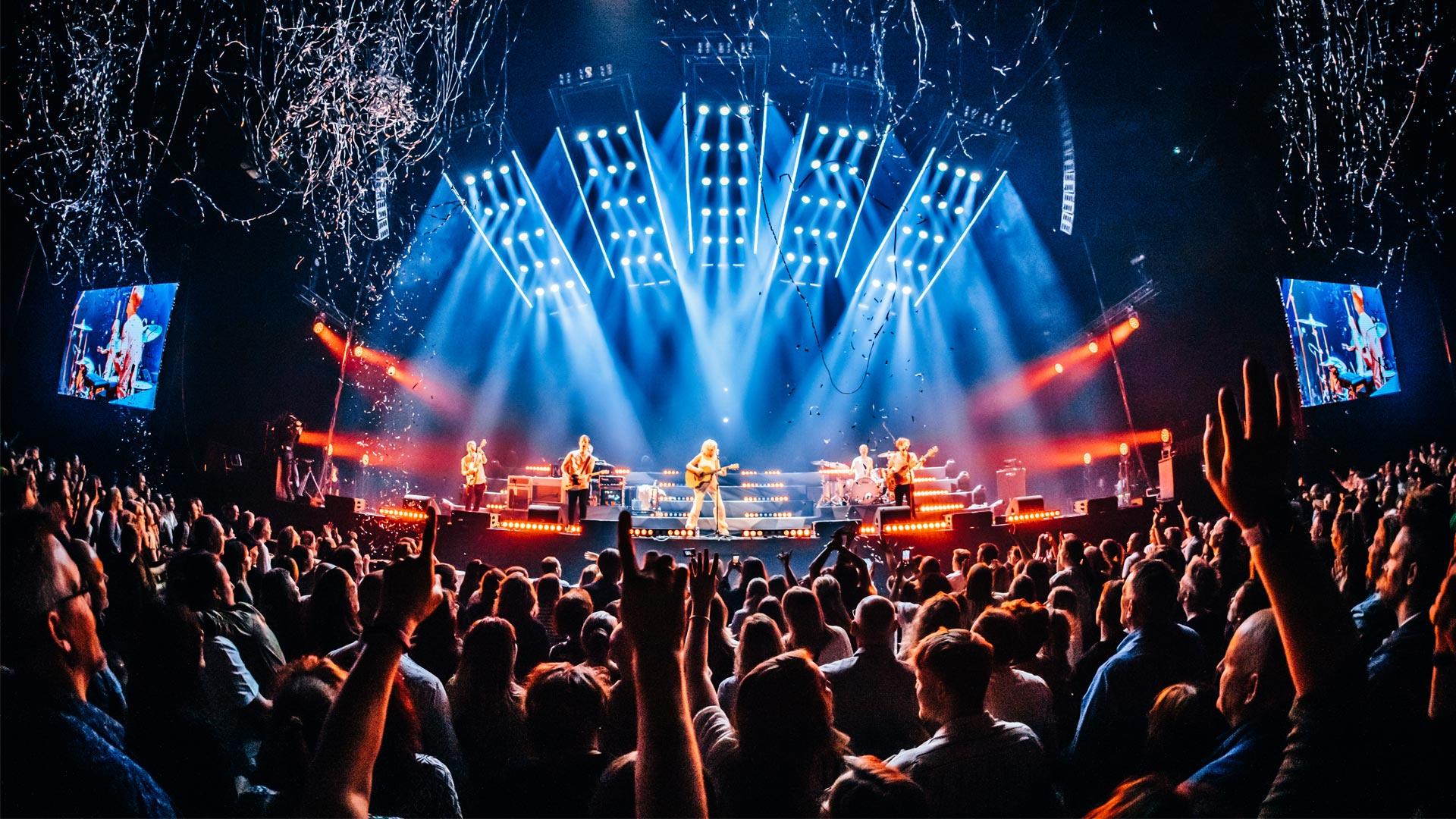
The Civil Media team developed a platform that connects brands with fans at the perfect moments during shows and special events. I was contacted to shape the identity of this business unit and help give the project visibility while reaching out to clients.
ANALYSIS

By analyzing the competition and market, we identified the opportunity to stand out with a strong identity, speaking as fans to fans, using a style that instantly connects with the shows aesthetic, both visually and through the designed assets.
Currently, competitors follow a more neutral software approach, leaving space for FanFire to enter the industry with a clear direction that would help build its client base.
CONCEPT
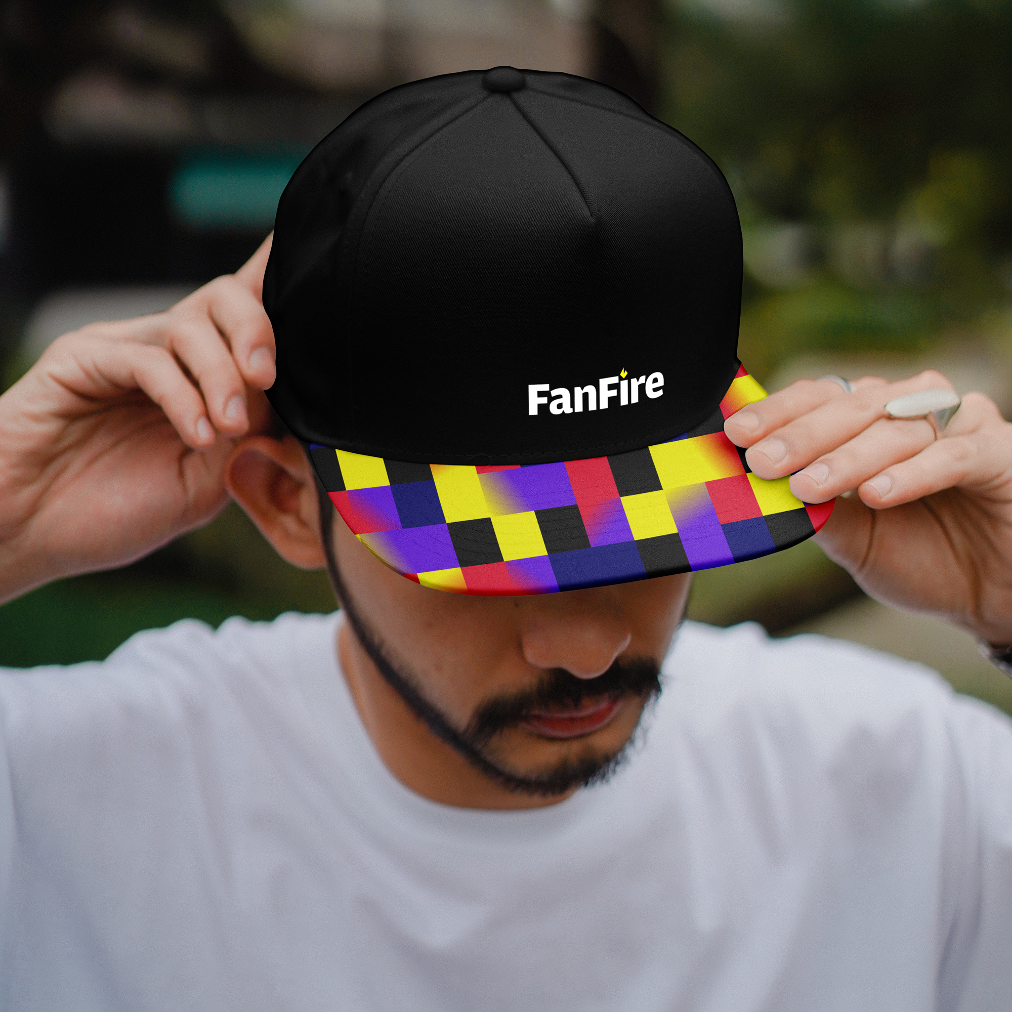
The core concept was built around modularity and a pixel grid, where each pixel, like each fan, has a unique connection with their teams and artists while also contributing to a rich and dynamic fanbase.
FanFire delivers a tailored experience by curating content and opportunities based on their interests and insights, ensuring a deeper and more personal engagement.
FanFire delivers a tailored experience by curating content and opportunities based on their interests and insights, ensuring a deeper and more personal engagement.
LOGOTYPE
![]()
![]()
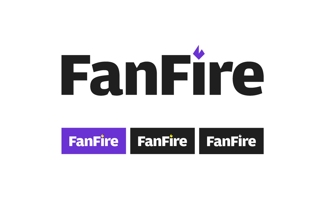

The logo is presented in lowercase to give the typography a warm, human feel. It features distinctive sharp ink traps, a detail that is adapted to create the symbol—a geometric, minimalistic flame that represents passion while also visually connecting to the tech and geek world.

FONTS
The primary typeface is Pennypacker, which offers a versatile range of styles. In this case, the Black version is used for headlines, while Regular is used for body text.
For body text, ThermalVF Regular Display Italic is added to emphasize the ending of phrases and slogans.
The primary typeface is Pennypacker, which offers a versatile range of styles. In this case, the Black version is used for headlines, while Regular is used for body text.
For body text, ThermalVF Regular Display Italic is added to emphasize the ending of phrases and slogans.

COLORS
The color palette is designed to create diverse color interactions, conveying a sense of movement and dynamism.
The logo's primary chromatic focus is violet and yellow, but in other contexts, it interacts with the full palette, through both solid color and gradients.
The color palette is designed to create diverse color interactions, conveying a sense of movement and dynamism.
The logo's primary chromatic focus is violet and yellow, but in other contexts, it interacts with the full palette, through both solid color and gradients.

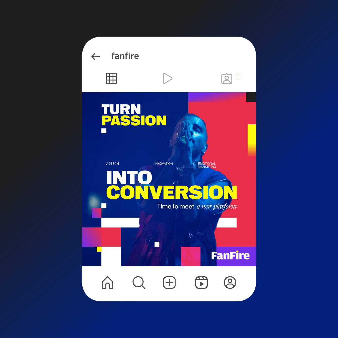
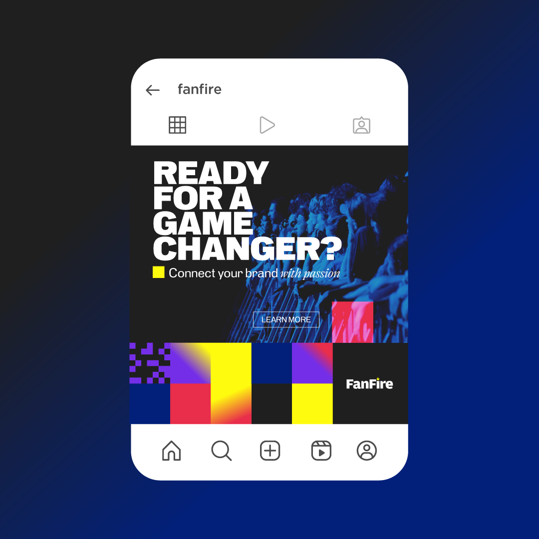
ASSETS
Playing with the grid is the soul of this proposal.
The pixel (and its proportionally scaled variations) is used to create dynamic structures within the pieces.


TICKET CONCEPT
Featuring a QR code that leads to an exclusive platform demo.
![]()
Featuring a QR code that leads to an exclusive platform demo.


PITCH DECK
![]()
![]()
