DATA SCIENCE
FOR SOCIAL GOOD
CLIENT: COLLECTIVE.AIPaolo Donizetti, Project Manager and Data Scientist at Collective.ai, approached me to explore the possibility of reinventing the company's visual identity. The goal was to reach new clients with a unified communication strategy focused on their comprehensive technological solutions through Deep Learning and AI.

ANALYSIS

VISUAL IDENTITY

The previous proposal featured a line-based isotype that did not fully represent Collective's idea of technology and innovation. Additionally, its stroke lost potency when scaled. There was also no version that unified both the isotype and the logotype; they only worked separately.
Furthermore, the brand used a range of violet color variations without a definitive, distinctive, and recognizable brand color.
Furthermore, the brand used a range of violet color variations without a definitive, distinctive, and recognizable brand color.
PROPOSALS

CHOSEN LOGO

The new isotype represents a more modern and minimalist approach, flexible in its integration with the entire brand system, generating greater brand recognition and ease of implementation across different media and communications.


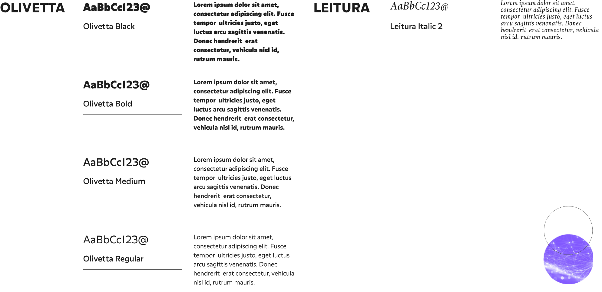
FONTS

COLORS

WEBSITE

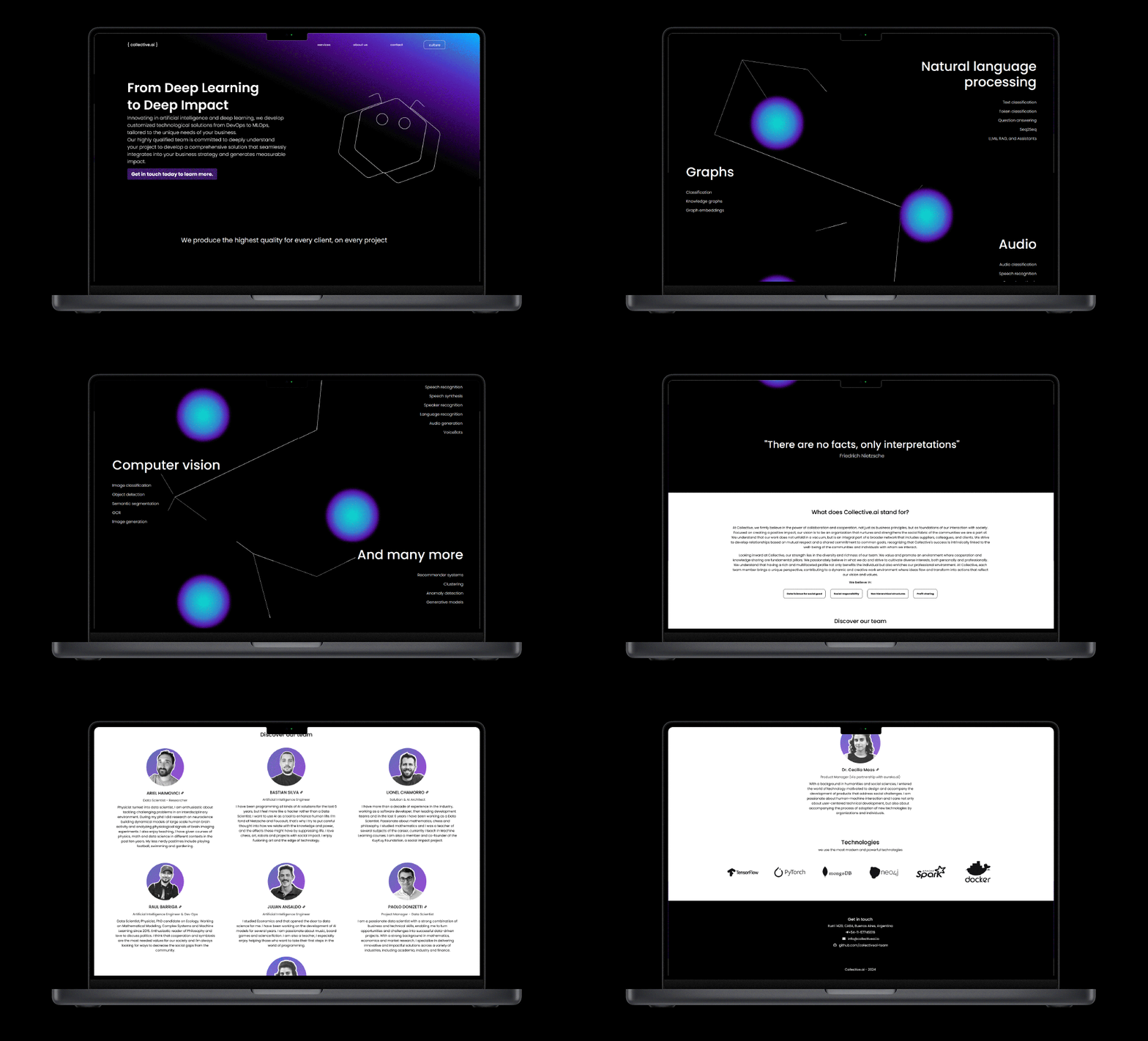
The previous proposal was a landing page that included both a description of the company and a list of technical possibilities (too specific for potential clients) and team members.
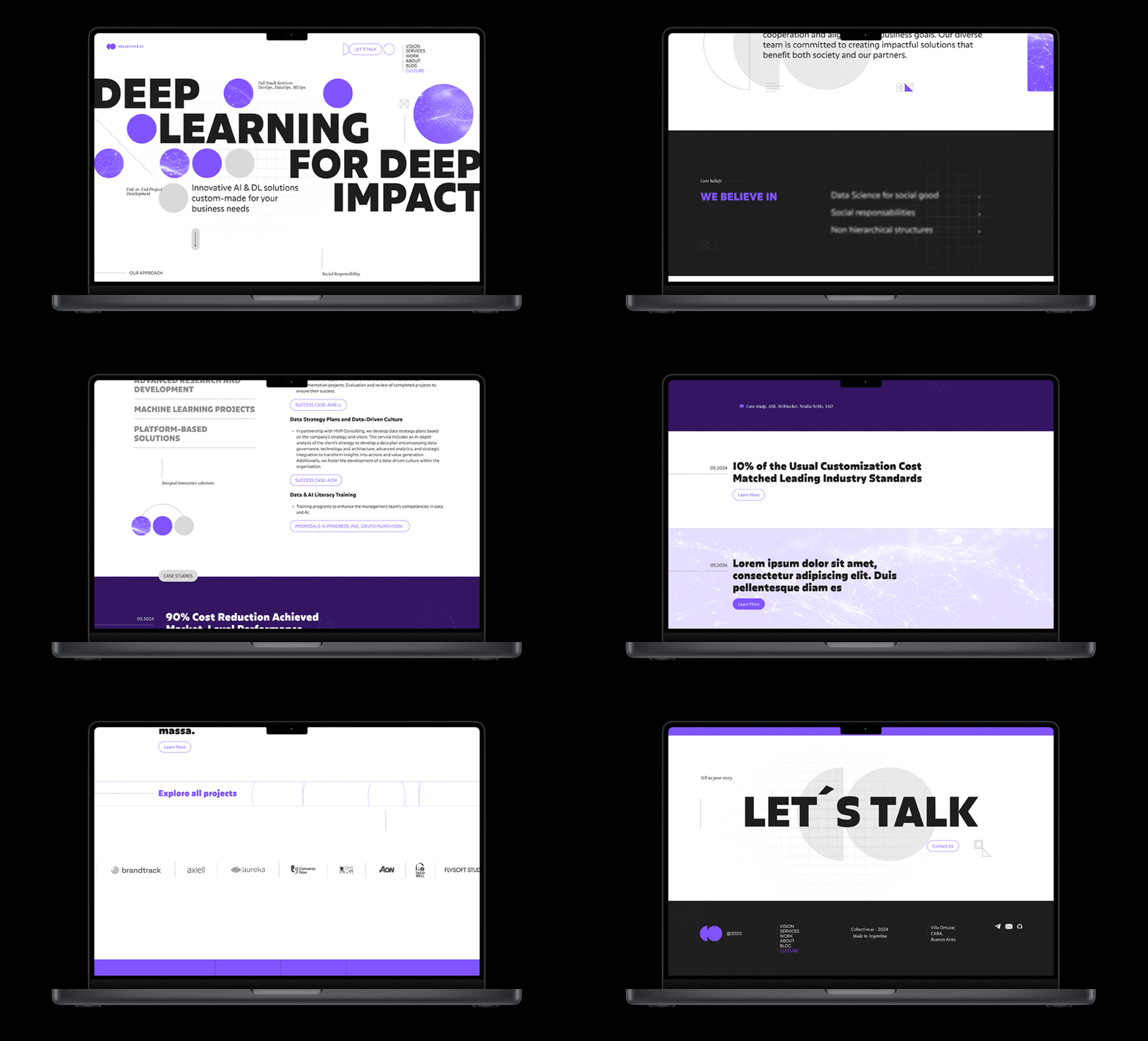
Together with the client, we decided to replace the capabilities section with a more general and conceptual detail of the company's services, in addition to adding a portfolio showcasing Collective.ai's extensive experience.
We also moved the team section to a separate page, where the company's philosophy and methodology are more thoroughly developed.
![]()
Together with the client, we decided to replace the capabilities section with a more general and conceptual detail of the company's services, in addition to adding a portfolio showcasing Collective.ai's extensive experience.
We also moved the team section to a separate page, where the company's philosophy and methodology are more thoroughly developed.

BEFORE
![]()

AFTER
![]()


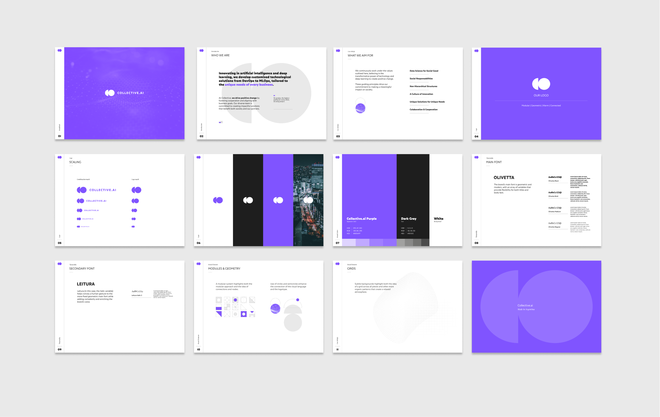
 BRANDBOOK

